How to make a single layout in FileMaker that works (and looks good) on both desktop and iPad screens.
Creating and maintaining two separate sets of application screens in FileMaker — one for mobile and one for desktop — has always been a pain in the butt. While there are definitely arguments to be made for creating much simpler functionality and screen design on an iPhone, the same argument is harder to make for an iPad versus desktop interface. Believe it or not, many people these days are opting to use ONLY a tablet with an attached keyboard as their primary work machine. Often, this occurs in the same workplace, where some users are on an iPad, and others are using a desktop computer.
Spending the entire day working on an iPad is a significant change in user behavior, and not simply because they are working with a screen that’s smaller than even the typical laptop. The real reason this is a significant change is that this user will not only be entering data by keyboard, but will use their finger as well to interact with the software. Instead of moving around the UI with a precision mouse and cursor, they’ll be smushing a fleshy digit on our beautiful software. As developers of this beautiful software, we need to design our user interface to meet users where they are, and not force them to do things that are more difficult in order to make our job easier. It’s essential that we address the different interaction style so that the user will be able to use the software in the way that’s most comfortable for them. But that has typically meant maintaining two separate (and potentially unequal) layouts for every screen — one with smaller type, smaller buttons, and more information for desktop, and one with larger type, bigger buttons, and more space between fields for iPad.

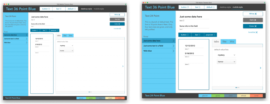
The two screens above are both the exact same layout — one is at 75% zoom on a desktop (left) and the other one 100% zoom on an iPad (right).
I maintain that it’s possible to use one single layout for both the desktop-and-mouse user and the iPad-and-touch user, using a few simple guidelines. The main trick is to design for iPad using touch-appropriate font and button sizes, and to add a trigger on layouts that simply zooms out to 75% when on the desktop! There are some considerations, however — specifics are provided below.
Start with the right layout size
Design for the smallest screen size in landscape* mode, which will usually be in the neighborhood of 1024 x 768 pixels (or points in FileMaker’s inspector tab). On the iPad specifically, when menu and toolbars are displayed, your layout should be around 1024 x 660, although it’s recommended that you disable menu and toolbars for iPad unless your users know what the hell they’re doing are power users. With menu and toolbars off, 1024 x 743 seems to be just about right.
Pixel resolution is actually different than screen size, and it can sometimes be a bit difficult to know what exactly your user will see (depending on retina vs. non-retina, iPad Pro vs. Air vs. Mini, etc), so it’s safest to make sure you look at your layout on the user’s actual device (or an identical model). User screen sizes and devices can also be audited with some basic user logging. Early in the discovery phase, we always add a simple logging feature to the client’s current system, where we then note their devices and screen sizes in the log file.
*For the purposes of this article, we’ll focus only on landscape mode, since iPad users in an office setting will almost exclusively be using the iPad with an external keyboard in landscape position.
Add layout triggers that zoom in or out
Here’s the primary trick that makes this whole shebang work — add an OnLayoutEnter trigger to your layouts (including card windows) and have it zoom out to 75% when the user is on a desktop machine. There are actually two ways to figure out what device your user is on, depending on your circumstances, but the simplest way is to use the Get(Device) function and look for a number 3 (which indicates an iPad). If the user is NOT on an iPad, you can have a script step zoom out to 75% (using the Set Zoom Level script step). If you also have users logging in using an iPhone, Webdirect, or even Android, your script logic gets a bit more complicated, and you may want to navigate to an entirely different layout, but either of the following functions will get you the info you want, and then you can Zoom to 100% for iPad, or 75% on desktop:
Choose the right font size
The default font size should be 18 point. This size is perfect for a touch interface and is within the recommended design guidelines for touch interfaces from Apple. It has the added bonus of looking almost exactly like 14 point when zoomed out to 75% on desktop! My current favorite font for Mac and iOS is called Avenir Next; it has a great variety of weights (more than just regular and bold), and looks consistently good on both platforms. When I have users on Windows, I find it’s safest to stick with 18pt Arial, which is kind of boring, but looks way better than Helvetica (according to certain high-ranking individuals here at AppWorks who shall remain nameless). Beyond 18 point, I usually fill out additional text object sizes with no smaller than 14 point, and no bigger than 36 point. It should go without saying that Comic Sans is to be avoided at all sizes and costs.
Anchor fields and objects so they fit a larger screen
Anchoring objects to the right side of your screen will help them fill in the empty screen real estate when zooming out to 75%. Which objects should be anchored is sort of subjective, but keep in mind that fields will open up to allow more data to be viewed when anchored to the right. There are also ways to provide additional fields that are visible only when you have a larger screen. For example:
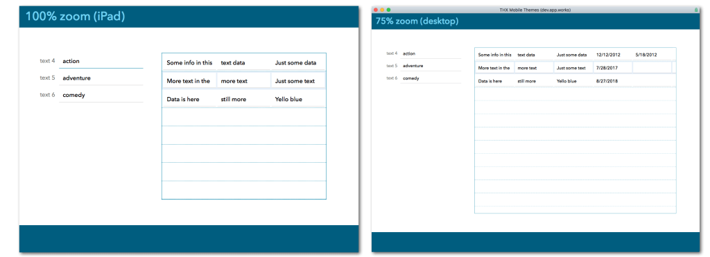
- Design a portal to contain, say, 5 fields. Then reduce the width of the portal by dragging the right edge so that it fits on your smaller iPad layout, and the fields at the right end of the portal rows are hidden. Then when you anchor the left and right edges of the portal, and the screen zooms out on desktop, the hidden fields at the right end of the portal are visible:

When the portal above is anchored to both the left and right sides, it widens to reveal additional fields when zoomed out on desktop.
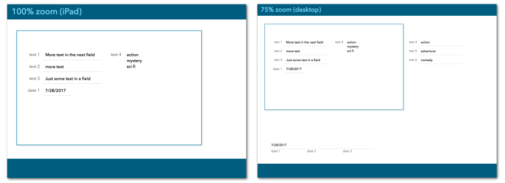
- Create a ‘data card’ using a rectangle with some fields on it, all anchored to the top/left. Behind this data card, place additional fields that are anchored to the bottom/right. When the screen is zoomed out, the fields that are behind the card are revealed below or to the right of it:

Fields that are hidden behind the ‘card’ slide out from behind it when the screen is zoomed out on desktop.
Check your layouts on both platforms
It may seem obvious, but you really need to view and test your layouts on both platforms. There are always small things that work slightly differently in FileMaker Pro versus FileMaker Go. Some of the things to watch out for in particular are:
- Animation – Go to layout script steps can (and should!) include animation in FileMaker Go. Screens can slide in or out from either side, below, or undergo fade / flip transitions, while FileMaker Pro doesn’t yet support it.
- Custom dialog boxes are different sizes on FM Go and Pro, and some text may get cut off in long dialogs in FM Go
- The position of popovers can vary significantly when the screen is displayed at different zoom levels, covering portions of the screen that the user may need to see when opening the popover
- In most cases, a hardware keyboard will be used with an iPad in an office setting, but be aware of how much screen real estate the onscreen keyboard takes up in situations where a hardware keyboard is not being used — it can really mess with the user’s ability to see what they’re doing!!
Caveats and gotchas
There is only one real ‘gotcha’ using this zooming technique, and that has to do with layout Navigation Parts. Recall that a navigation part is different from other layout parts in FileMaker, in that it’s always visible (except when in preview mode or printing), and it’s always anchored to the top or bottom of the screen. The one other aspect of navigation parts that causes a slight problem here is that navigation parts don’t scroll or zoom. If you design your layout for iPad and use a navigation part, any screen elements on that layout part will not get smaller when you zoom out for desktop, and if you’ve lined them up with objects below them on the layout, they won’t be lined up any longer when zoomed out.
If you avoid using navigation parts altogether, this is a non-issue. However, it’s also not necessarily a deal-breaker if you do use navigation parts. Since the navigation area should be hierarchically superior to the record(s) below (meaning they are distinct from data and really only hold controls and navigation), they don’t necessarily need to remain consistent with regard to the size of fields and objects below in the body area. But if it’s really bothersome for you (as I know some design nerds would agree), you could fairly easily create objects sized for the appropriate zoom levels, group them, and conditionally hide them using the Get(WindowZoomLevel) function. This is probably a bit distasteful, but certainly less so than maintaining two entirely separate layouts!
Conclusion
If you dislike maintaining the same layouts in different sizes for desktop and iPad, or you have users that only occasionally jump back and forth between platforms, or you’re just lazy, using the Set Zoom Level script step in conjunction with an OnLayoutLoad trigger and some basic design guidelines will save you many hours of layout time — Not to mention winning the adoration of your peers, a monetary bonus, and a lifetime of happiness. Probably.
If you have questions about the content in this article, feel free to contact us!
*This article was originally written for AppWorks, which has since joined Direct Impact Solutions. This article is intended for informative purposes only. To the best of our knowledge, this information is accurate as of the date of publication.
