
FileMaker Checkboxes
Here’s a quick guide to creating visually pleasing FileMaker checkboxes and radio buttons in a format that translates to WebDirect (and even includes emojis)!
Accessing FileMaker solutions via WebDirect is convenient, but has unfortunate limitations, especially when it comes to design. A common frustration among developers is that the formatting of checkboxes in FileMaker doesn’t translate to WebDirect. This occurs because checkboxes (and radio buttons) are controlled by the browser, and therefore render as standard HTML elements. Here’s our guide to creating visually better WebDirect checkboxes in FileMaker.
One solution to this problem is to avoid checkboxes and radio buttons altogether, and use button bars instead! We love button bars at AppWorks. In fact, we have multiple videos (1, 2, 3), and a three-part blog series comprised Techniques for Button Bars, Invisible Formatting for Button Bars and Dynamic Text Resizing in FileMaker, which are dedicated to the versatility of button bars.
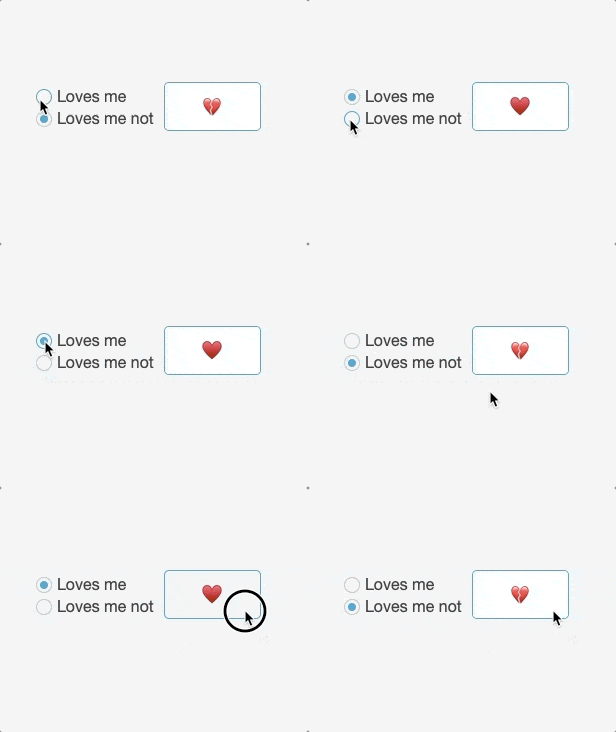
The technique outlined below can be applied to radio button sets with more than two options, and you can even add emojis! This method is perfect for boolean options, like marking something as a favorite, indicating whether or not an invoice has been paid. It also works for any situation where you would use a radio button set.
Using Boolean Fields in FileMaker
When using boolean fields, make sure your table contains a number field that corresponds to what you’re tracking. For example, I’m marking something as a favorite, so my field is called “isFavorite”. That number field will use a custom value list containing only the number 1. 1 corresponds to true, and 0 is false.
Next, grab a button bar, give it two segments, and style it however you’d like. I removed the border and made it show an icon only.

Each button will have only one step, which will be the same for both buttons: use the “Set Field” script step, specify the field to your boolean field, and set the calculation to “not [field]”
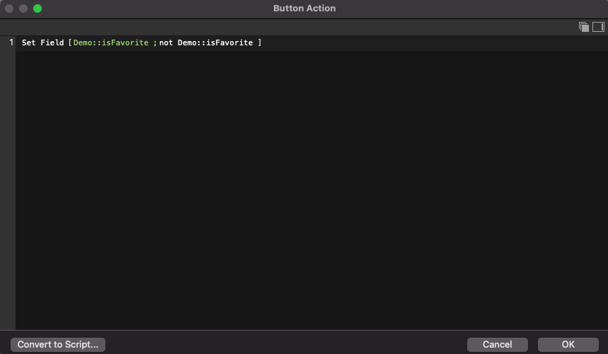
This should be enough to put in basic functionality.

Don’t stop here though! Both buttons can be used to toggle the field, and we want to use one for on and off. We’ll do this with conditional visibility.
First, go to layout mode. In the Data tab of the inspector pane, select the “on” button and scroll down to “Hide object when”. Click the pencil and enter “not [field]” because we want to hide the on button when the field is set to 0. Select the off button, click the pencil and enter “[field]” because we want to hide the off button when the field is set to 1.
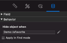
By default, this will stack the button segments on top of each other.
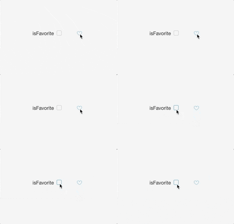
From here you can also add visibility styles or conditional formatting to the buttons to extend their customization.
When Using WebDirect…
This method doesn’t produce exactly the same results when it translates to WebDirect, but there’s an easy fix. Instead of a single button bar, use two stacked buttons with the same visibility settings as the button bar segments.

Using Radio Buttons in FileMaker
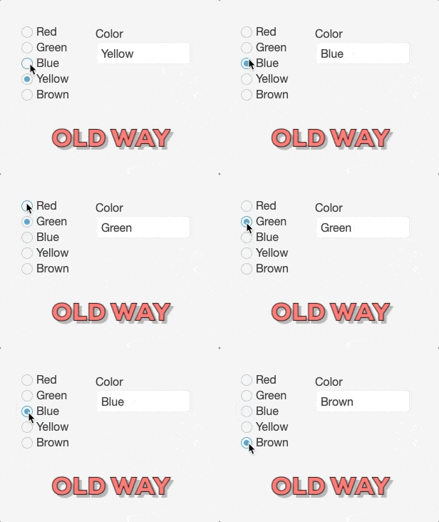
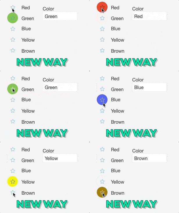
A similar technique can be applied to replace radio buttons. With a little bit of conditional formatting, you can make radio buttons much more interesting. First, I made a simple color selector. I used a vertical button bar without a border and with icons only, and rounded the corners of each segment. Each button sets the field “Color” to its corresponding color. Each button is conditioned to change the fill and icon color when the field is set to that color.
FileMaker and Emojis
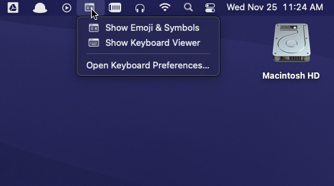
Did you know that FileMaker supports emojis? If you’re on MacOS, you can use emojis throughout your solution, even in calculations. Click on the Symbols and Keyboards menu from the top left and select “Show Emojis and Symbols.” Once you’ve completed this step, you can insert emojis just like text.
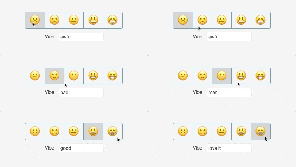
From here, instead of your button bar using icons only, set it to text only, and insert emojis as you would text. Now you can create all kinds of fun buttons.
If you have any questions about formatting checkboxes in a format that translates to WebDirect, feel free to contact us!
*This article was originally written for AppWorks, which has since joined Direct Impact Solutions. This article is intended for informative purposes only. To the best of our knowledge, this information is accurate as of the date of publication.
