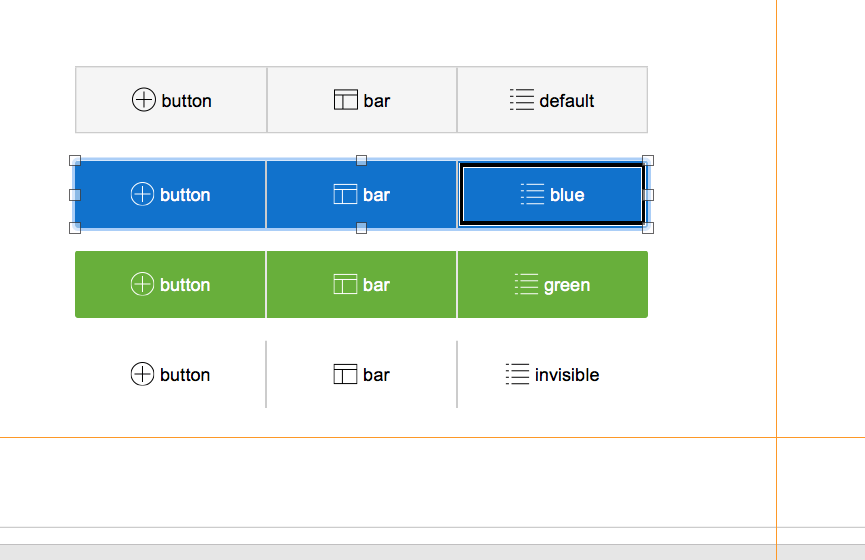
FileMaker button bars, for me, are the single most useful new feature introduced in FileMaker 14 (aside from the Script Workspace, which is a beautiful thing). Interestingly, the reason I find them so useful has nothing to do with their primary intended use case: the navigation bar.

Most Useful Features of FileMaker Button Bars
Sure, a simple and neatly-aligned navbar is great to have. Being able to switch segments from a regular button to a popover and back again is truly useful for speed of UI design, but the killer feature of button bars is the calculated label. This feature alone is, as they say, worth the price of admission. It means that you can display output from FileMaker’s calculation engine right at the user interface level. Prior to FileMaker 14, this was not available without creating a calculated field or resorting to script or Let statement variable tricks.
We’ve started using FileMaker button bars all over the place just for access to the calculation engine. Things we might have formerly accomplished by running a script, then creating (and managing) a $$ global variable, then placing that variable on a layout, and then refreshing that layout, ALL are replaced with a single calculation inside a button bar’s label.
Upcoming Topics
I started writing this article as a one-off, and was going to document button bar techniques. However, I had enough material to make an actual series of blog posts, so that’s what I’ll be doing. This post will be followed up with a set of blog entries describing the following button bar techniques:
- Replacing simple merge data with dynamically formatted text, including calculated data and button states.
- Using button bars to eliminate the need for another calculated field, just for displaying data.
- Using button bars as a replacement for fixed-position portals on a “dashboard” with dynamically-positioned button bar segments containing aggregated data.
- Displaying actual data, aligned in columns that dynamically shift their alignment when empty.
There are numerous other ways to use the calculated label of the button bar to accomplish UI tricks. Prior to FileMaker 14, these were much clunkier (if not impossible) to accomplish.
*This article was originally written for AppWorks, which has since joined Direct Impact Solutions. This article is intended for informative purposes only. To the best of our knowledge, this information is accurate as of the date of publication.
