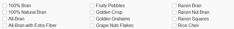
Checkbox sets have been a staple in Claris FileMaker development for decades. They are simple to use, easy to implement, and help ensure data integrity. However, from the standpoint of a user, they can be clunky and prone to incorrect selections, especially in large lists.
Checkbox sets have been a key element in the development community because they are easy to understand. All that is needed is a simple value list and a quick change in the field control style to display the list on the field. The style of the check can be modified to a check or an x.
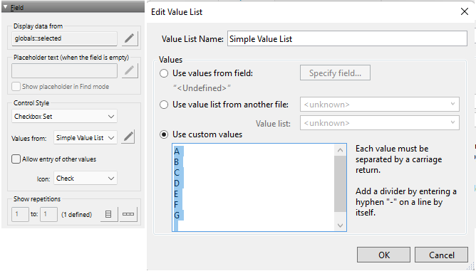
Using values from a field is exceptionally powerful and allows a developer to dynamically generate the values for the list.
One way that FileMaker is powerful is that in displaying from a value list, a developer can display only data from a second field, but still save the related ID. By normalizing the data this way, a developer can create a list that can update all records in a system at once. For example, if a customer changed their name because they were married, a user would only need to update the customer’s record in one place.
However, checkbox sets are not without their pitfalls and limitations:
- They don’t work as well when there are many values that change often
- Larger lists use significant layout space and can be unruly
- Adding values can break a well-crafted layout
- Removing values can prevent previous selections from being displayed
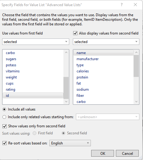
- Value lists only have the option of showing data from 2 separate fields, which may not provide enough information for the user to make an appropriate decision
- The checkbox set also has very limited styling options
Modern UI/UX Alternatives to Checkbox Sets
Thankfully, there are alternatives to using checkbox sets that perform similar functionality.
2-Button Button Bar
Button bars were revolutionary in FileMaker. They added the ability to use SVG icons and calculations.
Combining this functionality with the hide object calculations, a developer can mimic a checkbox set while ensuring the layout doesn’t change.
This method has many strengths:
- Because it is not tied to a single text field, all styling options are open to the developer
- By using the button bar, a developer can use different icons for checked and unchecked states
- A text value can be calculated to different text when the item is checked or unchecked
- Creates a consistent look across multiple platforms by allowing the developer to make precise placements
However, this method is not without its pitfalls:
- It can require additional scripting
- If so, developers must manually change the layout
- It requires many calculations to show and hide the appropriate objects
This method works exceptionally for a 1-item checkbox list to ensure consistency in appearance. It also works well on layouts where there are multiple items a user needs to set individually, such as a user preferences layout.
Checklist Portals
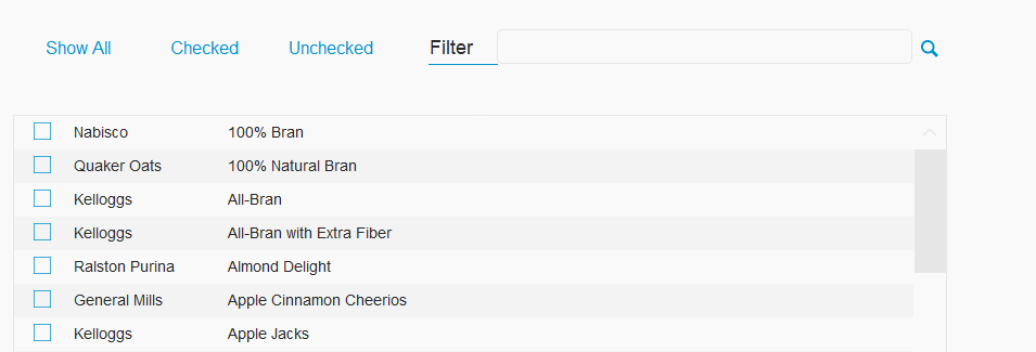
This method allows for lists to be dynamically updated by using a related table, either with a cartesian join or a regular relationship.
The benefits to this list are numerous, including:
- The ability to display as much data as needed
- The list can be dynamically filtered by allowing the user to provide search terms to reduce shown items
As with any other method, there are also drawbacks:
- Unlike checkbox sets, portals cannot be formatted into multiple columns
- The value list feature cannot be used in this method, so another table may be required
This method’s versatility allows it to be implemented easily in many scenarios, such as:
- Replacing an existing checkbox set where the list grows, but space is limited.
- When a user may only want to see a smaller subset of the overall list by using a filter.
- A large value set where a user needs to see additional information. (i.e. a full address)
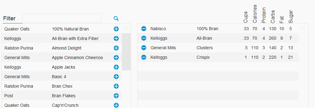
2-Portal Selector List
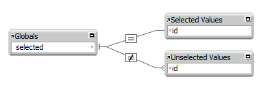
- It automatically filters the list for the user, allowing them to easily see what is and isn’t selected
- A designer can show more details in one portal and not the other
Compared to the other methods, the largest drawback of this method is the understanding of FileMaker mechanics, followed by the amount of space it requires to implement.
This is useful in many scenarios, such as:
- Quizzes where a user needs to put items in the correct order
- A comparison list that allows a user to select multiple items to display more details
- When a value list is exceptionally long, and users need to verify that the appropriate options are selected
- As part of a wizard allowing options to be set and automatically created upon completion
Conclusion
Claris has provided many useful new tools over the last several versions of FileMaker. As developers, we should leverage these tools to provide a cleaner, better interface for our users.
You can download the sample file to play around with ways to implement these methods into your own solution(s).